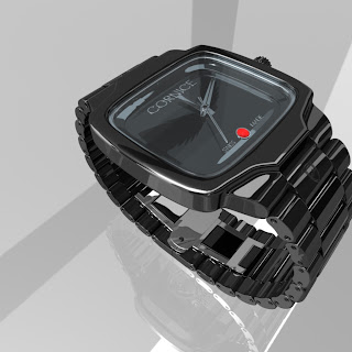
First, I drew out the shapes in Illustrator and then imported them into Maya as curves (shown in older posts)... unfortunately, I had no clue what I was doing and ditched that idea. I now know how to do it that way, but I did not used that method for this project. Instead, I reverted to good ol' box modeling. Here's what I came up with (click for larger image):

The shape was weird and I had a hard time building this without getting triangles... I literally rebuilt this about 20 times, and I still would have built it differently. Finally got it to work though.
Alright, so next I delved into the main body some more. I deleted the area where the glass would be, and the bottom where the back plate would be. I had to tweak this quite a bit to get everything just right.

Alright, so next I delved into the main body some more. I deleted the area where the glass would be, and the bottom where the back plate would be. I had to tweak this quite a bit to get everything just right.

Next, the band. The cool thing about the band is how I bended it. I just selected all of the duplicated links, grouped them (ctrl+g) and added the same bend deformer that I used on the links. It just took some tweaking to get it just right!

Finally getting to the end. At this point I've started messing with the mental ray shaders. I knew I wanted it very shiny like chrome but darker. ALL of the shaders are from the mental ray shaders built into maya--they are surprisingly rockin!

I was pretty happy with it the way it is now... but then I found out about image based lighting. First, what makes chrome look shiny? The objects around it. That's why the inside of the wrist band looks better than the outside--because things are being reflected. IBL gives the watch something to reflect. Here are my final renders and this is what the IBL did. Enjoy!


