So, I have to design a catalog in my Type, Image, and Visual Continuity class. Well, we need materials to fill this catalog with... so, my teacher thought we could make some masks! Yea! Anyways, this is what I came up with.


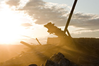
Side note--this was a shed at my Grandpa's that I was helping him tear down. It was very bittersweet because that shed has been there for as long as I've been around. It's not completely down yet but it will be soon. Here's what the aftermath looked like when we were done. Here's looking at you Shed.

This project was especially ridiculous... it took MANY hours to recreate this photo with type... and I was never quite happy with it. The picture on the right was done in my photo 1 (film) class.
The type picture was done in illustrator.
A lot of the stuff I had done prior to this point was somewhat grungy and didn't scream "take me serious as a graphic designer!" So, I decided to go outside my usual box and create something more... not me. This is the end result. A brochure for my sister- she never ended up using it because she had no need for it, but it was fun nonetheless.
Created with illustrator, photoshop, and indesign.
Here's what the printed product looks like. Don't mind the pictures--they're a little crappy.
Now, as a graphic designer, the number one rule is to never fall in love with your own work! Why? Because it can always be better and it's not always going to be what your customer wants. Well, I have to say that I have broken the cardinal rule on this poster-- I love it. It's one of my pieces that I have any desire to change. To be fair though, I'm sure there are things that could make this better. Anywho, for this project we had to design an 11X17 poster based on some font. I chose helvetica.
Created with illustrator.
This project was mix between my English 2010 final and my typography final. For Typography we needed to create a 4 page magazine spread about whatever we wanted. For my English class a group of us had to create a magazine about the Iraq war and how music has affected people's opinions. I created all of the spreads and wrote the article called, "Confessions of an Anti-War Musician." I also wrote a little section about Thrice in the Fallacious Quotes section. It was a pretty fun project because my group members were fairly pro-war and I am quite the opposite. This was a lot of work but it was a lot of fun
NOTE- the majority of the images used were taken right off the internet. The magazine was not used for profit and credit was given where due.
Created with photoshop, illustrator, and indesign.


